Earthy color palettes for natural branding

Earthy color palettes are ideal for brands that want to feel natural, cozy, and timeless. These tones evoke calmness, trust, and quiet luxury vibes.
Maybe your current brand colors don’t align with the warm experience you want to offer. Perhaps your brand feels too bright, too corporate, or just not quite you. The right color palette does more than look good—it brings warmth and comfort to your brand.
Earthy colors create a cozy, grounded feel, perfect for brands that convey warmth, comfort, and authenticity. Whether you’re drawn to cozy fall vibes, cottagecore, or the timeless elegance of light academia, earthy tones help your brand connect with audiences who appreciate subtle, organic beauty.
Earthy tones are versatile yet soothing. They reflect the beauty of nature and have a timeless quality, making them ideal for brands that value authenticity and elegance. Earthy palettes also feel calming, allowing them to appeal to a wide audience who may connect these colors with mindfulness, comfort, and simplicity. If you love cozy fall vibes, cottagecore, or light academia, earthy tones can help you connect with those who appreciate subtle, natural beauty.
Greens, browns, beiges, mustards, soft yellows, rusts and muted reds are the base. You can add different colors that feel soft and natural – some blues, pinks and oranges.
Why Earthy Colors Connect with Your Audience
Choosing earthy colors goes beyond aesthetics—it creates a sensory experience that builds trust and connection with your audience. Here’s why these colors resonate so much:
- Associative Learning and Color Memory
Colors carry memories and emotions based on our experiences and cultural associations. Earthy tones like green, brown, and beige often remind us of nature and tranquility. When your brand uses these colors, it makes a subconscious connection, letting your audience feel a sense of calm and grounding. This familiarity helps establish an emotional bond that goes beyond the visual and creates trust and comfort. - Activation of the Parasympathetic Nervous System
Earthy colors calm the nervous system, helping us relax. Soft greens, browns, and muted beiges are easier on the eyes than bright colors, making your brand feel like a safe, inviting space for your audience to connect. - Cognitive Fluency
Our brains are wired to prefer things that feel easy to process—this is called cognitive fluency. Earthy tones are natural and familiar so our minds instinctively find them easy to “read” and comprehend. It means your audience will feel at ease, and more likely to stay engaged with your content if they’ll find it familiar. - Emotional Resonance and Nature’s Calm
Using earthy tones creates a calming, nature-inspired experience. These colors invite clients to slow down and connect, building strong emotional resonance.
Calming, grounding colors help your audience feel at ease, making your brand feel trusted and welcoming.
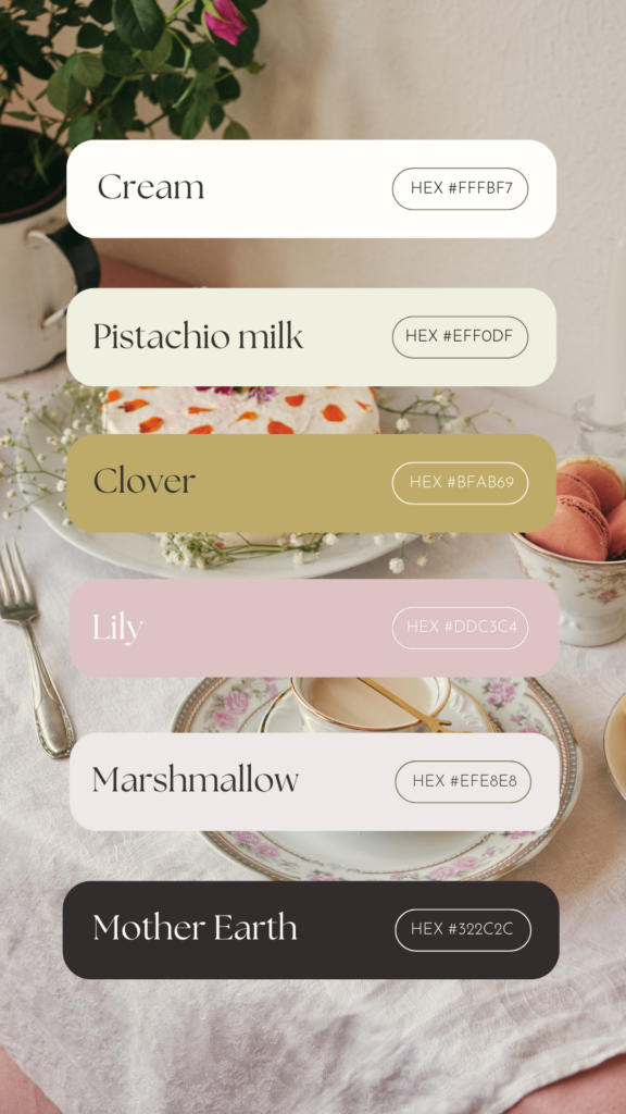
Earthy color palettes in action
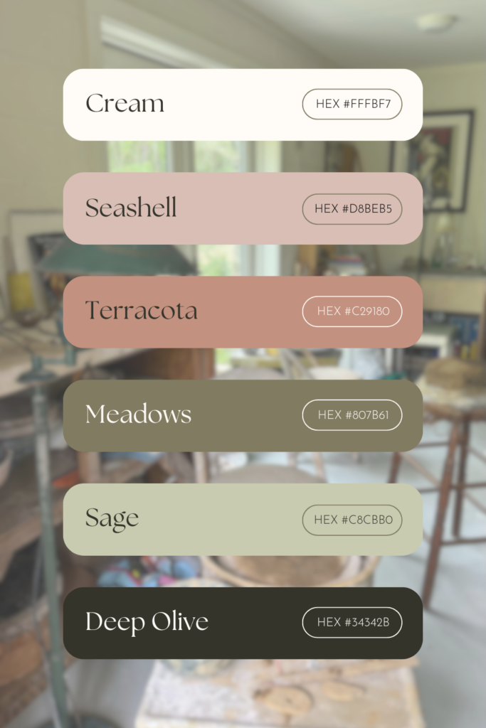
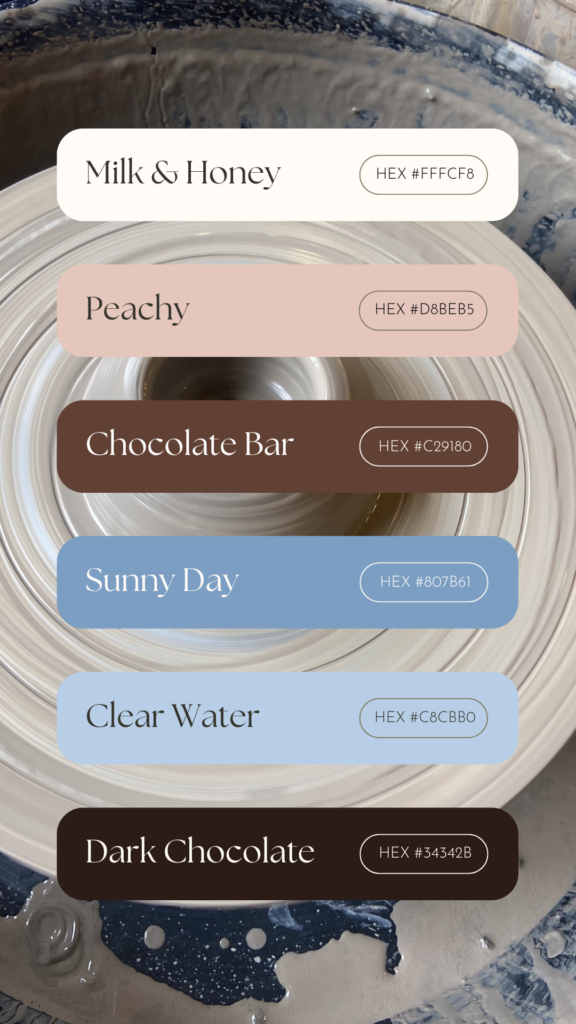
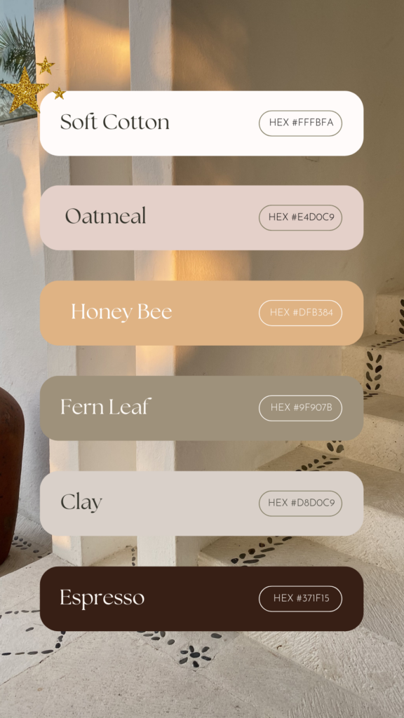
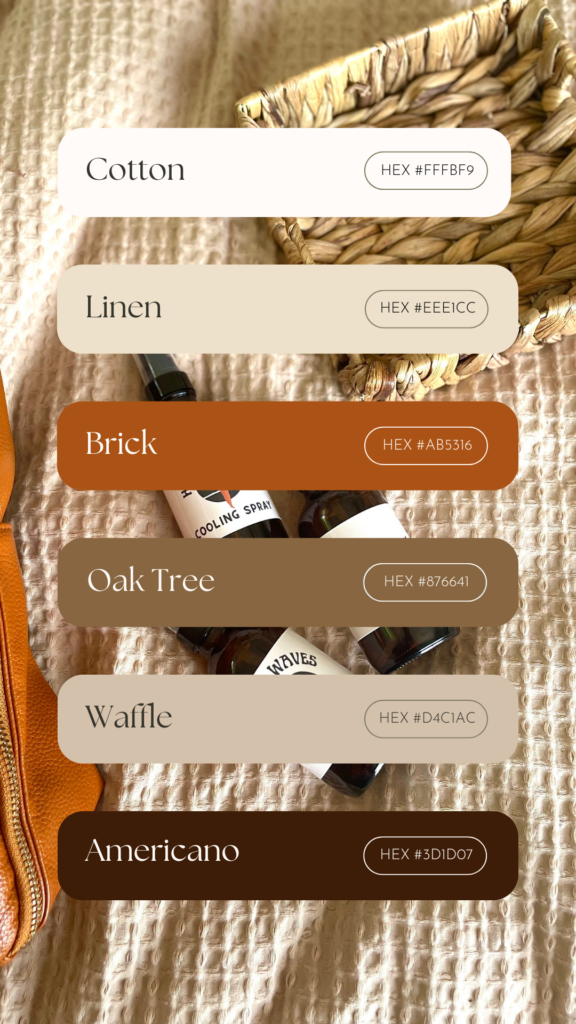
I’ve created ready-to-use earthy-toned palettes and will update this blog post with more examples in the future. These palettes were created with accessibility in mind. So, there are always very dark and light shades, accent colors and neutrals. Having a color combination like these allows you to create content more easily as you are more flexible and the content will remain readable.
Resources for color palette creation
Color palette creation tools:
Inspiration:
- Pinterest: look for photos, paintings, packaging, print design
- Dupe Photos
- Pexels
Stock photos with earthy vibes sorted by colors:
Keywords to Inspire Your Palette Choices
When thinking of earthy tones, consider keywords like: earthy, cozy, vanilla girl, cottagecore, fall vibes, tea, pottery, warm white, light academia, dreamy, comfy, coffee, vintage, tea time, mid-century modern, retro, croissant, plant, linen, bedding, ceramics, quiet luxury. These words capture the feeling and ambiance associated with earthy color schemes and can inspire your palette.
Natural color palettes examples
Bringing Natural Color to Your Brand Experience
Earthy tones give your brand a timeless, cozy feel that puts your audience at ease. From warm whites to soft greens and browns, these colors communicate authenticity, warmth, and trust, creating a welcoming, emotional connection with your audience.
With your new palette, let your brand reflect the values that matter most—whether that’s comfort, elegance, or quiet luxury. These colors can be a gentle reminder of the calm and beauty found in simplicity, making them the ideal foundation for a meaningful, lasting brand presence.
Need help creating a truly magical brand? I specialize in creating warm, natural branding experiences that connect with your ideal audience on a deeper level. If you’re ready to bring your brand’s vision to life with colors and visuals that resonate, I’d love to work with you. Explore my branding services here and let’s create a brand that feels like home for you and your clients alike.